

As the weather is continuing to be grey and rather miserable, I thought I’d start this week with some more colour inspiration. Don’t worry, I am not talking about all things green again, for those of you that found last Monday’s Colour Edit wasn’t quite to your taste. We are looking at Colour Palettes today, and how they can help you create a cohesive colour scheme throughout your homes.
Interior Design Tips – #How to Use Colour Palettes
Colour is one of the first things we visually absorb when we enter a room. Being a powerful design tool, colour can affect how we feel as well as our perceptions of how our spaces look. Adjoining spaces that use unrelated colours, can make your home feel disjointed. Colours that relate to each other using a colour palette help draw the eye from one space to the next.
If you want to feel comfortable in your homes, then ensuring your spaces flow is one of the keys to a successful design. This is where putting together a colour palette helps.
Plan Out Your Spaces
When planning out your spaces, it’s important to consider the overall colour scheme to your homes. Even more so for open plan areas, or spaces that open up onto each other. Consider how one room will flow into the next, what mood you want, and the items to be incorporated into the palette.
Plan one room at a time, and use one color in different proportions in all rooms. An example of which, is to choose a wall colour in one room and the same colour as an accent in another.

Nature is a great place to start to creating your colour palette. Flowers from my wedding day, are the inspiration behind this colour palette.
Colour inspiration can be found everywhere, and anywhere. Take time to create your colour palette. Produce a mood board/notebook of photos, magazine cutouts or cut up paint charts to bring your colour choices together. Once you’ve got your ideal colour combinations, and you’ve checked out the lighting in your rooms, your good to go.
Lighting & Colour
Don’t forget the lighting!! In an ideal world, you should have your lighting in place/planned before deciding on any colour. Lighting affects how we see colour. Before you start to build your colour palette, it’s a good idea to check out how much natural light each space receives. Colour can look completely different as the day moves from morning to night, and artificial lighting also has an impact with the different types of bulbs used. To read more on Lighting and colour check out my Lighting Guide Part 3 here.

Not sure where to start? Then may you could take some inspiration from a favourite piece of art or furniture. It’s a good a place to start as any.
Test Before!
To see how your colour palette works with each space, you need, to get test them out. Get tester pots and paint large squares of paper (nothing smaller than A3), with samples of your colours, applying at least two coats. Move the samples around each room during the day to ensure your happy with how the colour looks.
TIP: Try not to be too rigid with your palette. Remember, you’re looking for a visual connection between spaces. Whether it be one or two colours from your chosen palette, or all of them. Another option is to choose different hues from your colour choices. You don’t want samey, samey in each room, just spaces that flow visually with the application of colour.
Once you’ve got your ideal colour combinations, and you’ve checked out the lighting in your rooms, your good to go.
Inspiration | Colour Palettes
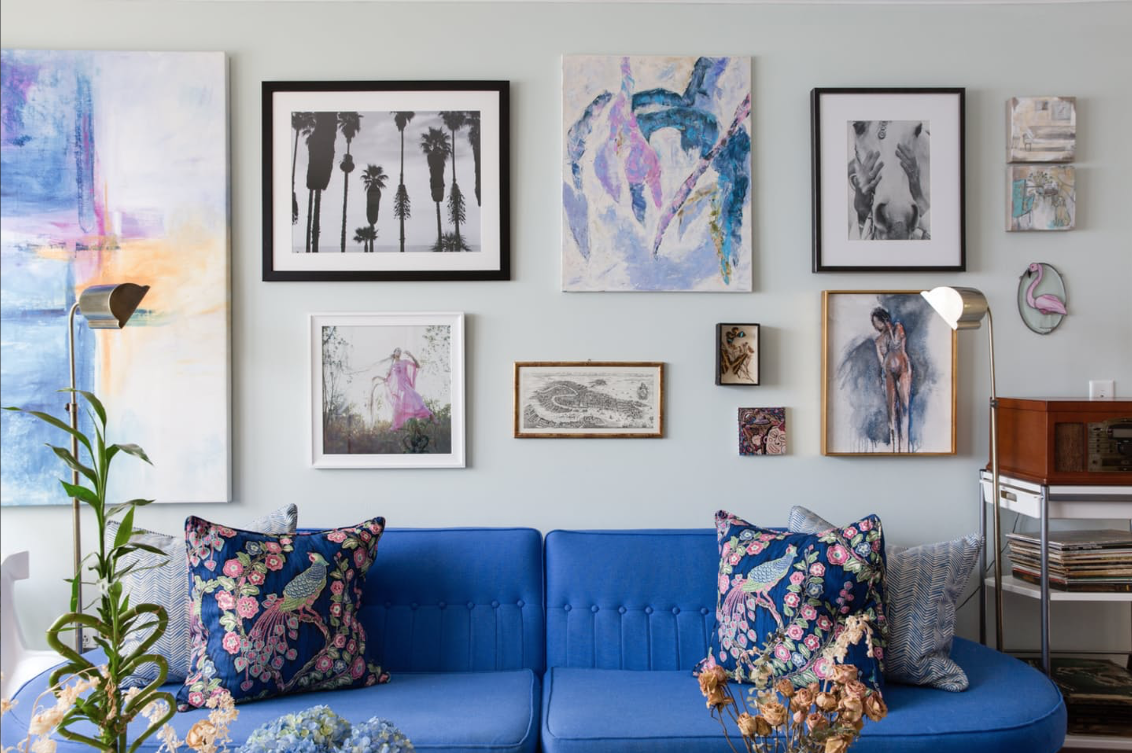
Below is the beautiful home of Millie Sims. Her apartment uses a colour palette of blues, pinks and lilacs to connect each of the spaces whilst retaining each rooms individuality. (All Images via Apartmenttherapy.com).

The main living room takes centre stage, setting the colour palette of blues, lilacs and pinks for the rest of her apartment.

Colour Palette inspired by Millies’ Apartment

The dining room is visible from the main living area, and already you can see the connection of her chosen colour palette with a darker hue of blue dining chairs.

The use of artwork, furniture and accessories are put into play, introducing each of the colours from her colour palette. Even the pink oriental lilies fit in with her colour scheme. It can be the smallest of details using colour from a colour palette that connect each room.

The spare bedroom introduces hot pinks and orange from the main colour palette. There is a still a sense of with the serenity and calm with the palest of blues as a backdrop.

Each room is kept individual by utilising more of one colour over the other. The master bedroom focuses on lilac and muted blues, and only a tiny amount of less vivid deep pink (on the cushions); creating a restful, calming feel to the space.
Planning out your colour scheme may be the best way to introduce colour, especially if you find it scary.
That’s all from me today. If you have a particular problem or would like to see a post on anything specific, give us a shout. Either in the comments box or head towards the contact form in the sidebar of the blog and drop me a line.
As always, thanks for stopping by and reading todays post, and for any comments, likes and shares!
Maria


No Comments